Company: Ondas
Ondas is a U.S.-based technology company that provides solutions for industrial wireless networking. For example, when oil or gas companies require remote communication, which can be critical to their operations and profitability, they will use wireless networks instead of putting a cable in the ground.
Ondas offers not only radio hardware but also the network monitoring system for the remotes.
Challenge: From Internal Tool to External Offering
Ondas’ network monitoring system was built in 1993 and has never been redesigned since then. It has an outdated, entangled UI/UX, with an array of new functions built upon older ones.
Ondas decided to revamp their legacy system, so they can offer to their clients a cloud-based, white-label platform as an alternative for Ondas’ technicians monitoring the clients’ networks for them.
The system was efficient enough all these years only because its sole users were Ondas’ technicians who already knew their way around it. But to onboard new users will be problematic, not to mention trying to successfully market the system.
Big changes were needed.
Solution: Usability, Simplicity & Agility
As a first step, we conducted several UI/UX discovery sessions to find out how Ondas’ personnel currently work with the system and what are their main pains. We wanted to put ourselves in their shoes to understand how the platform can be improved beyond obvious redesign.
Our key questions were:
- How technicians’ day-to-day looks like
- What tools within the system are used the most
- Which elements of the user interface are the most critical
- How we can improve the overall user experience
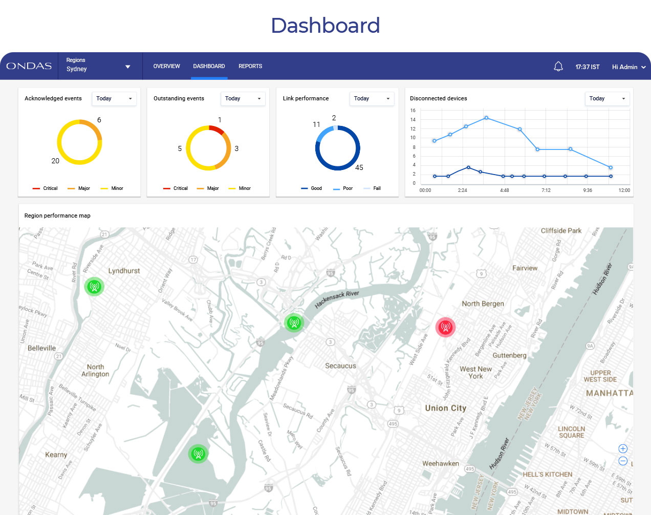
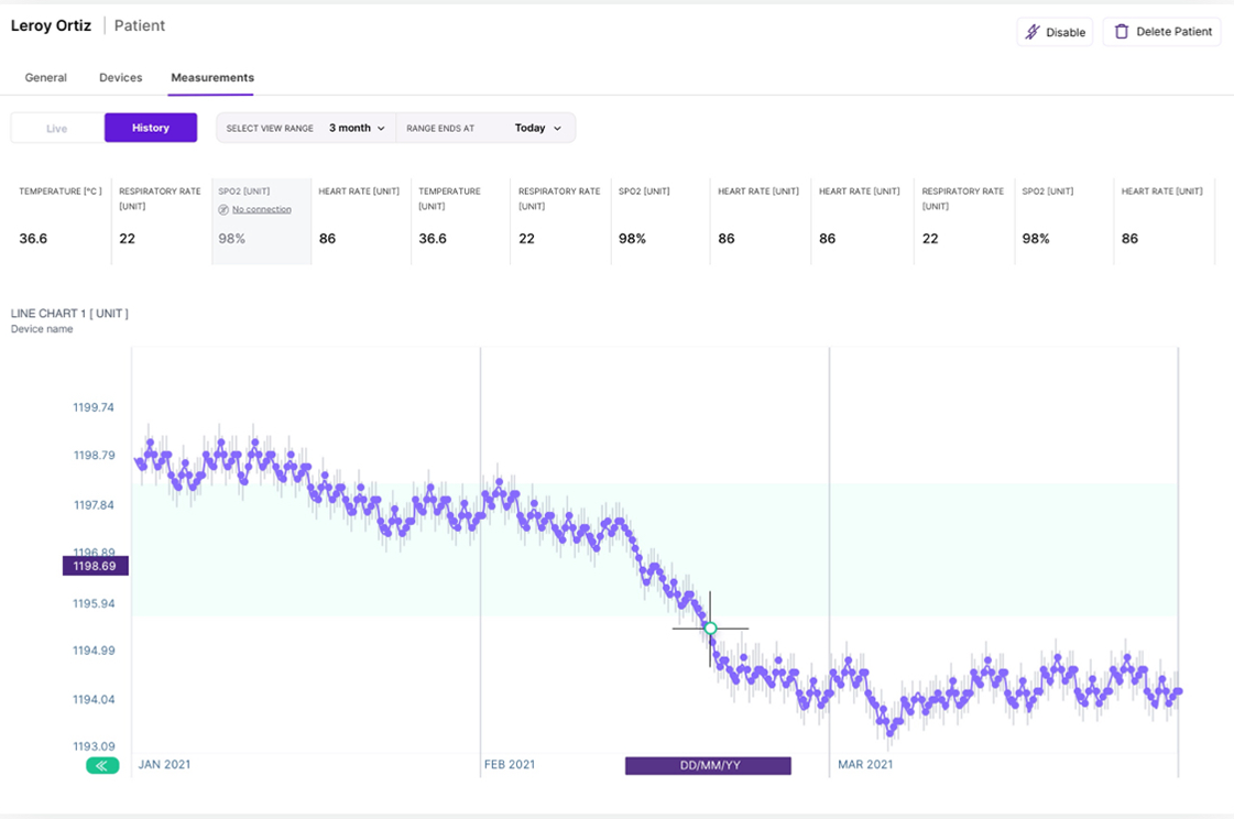
Performance
During our interviews, we discovered that technicians spend around 60% of their time on the Performance page. If there is a problem with one of the base stations, all the work will be conducted there.
The new interface will enable users to choose a graph type and monitor the performance of this specific element more seamlessly.
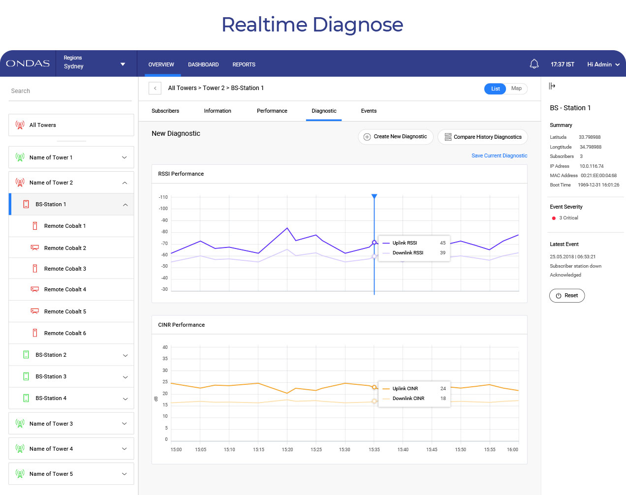
Diagnostic
Another adjustment on the Performance page is the Diagnostic tool. Technicians use it to send pings to base stations and receive results. To streamline the process, we added a graph type drop-down list and option to choose a duration.
An important insight we got from the user interview is that sometimes diagnostic needs to be performed for several base stations simultaneously. We provided this option by introducing tabs inside the Diagnostic window.
We also enabled users to minimize this window and go back to using the system while the diagnostic runs in the background.
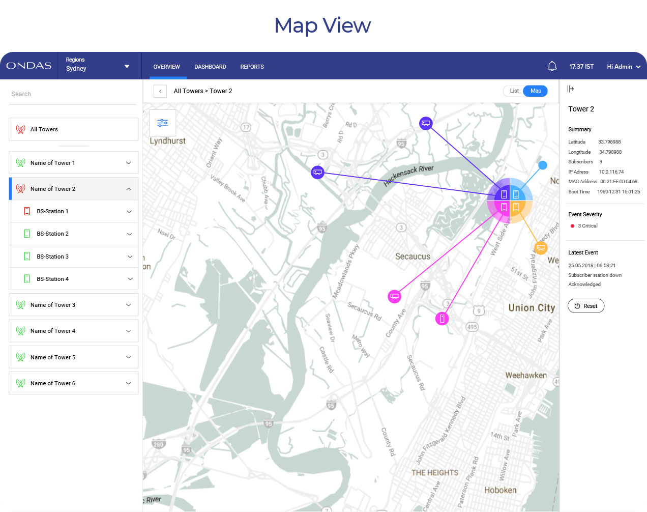
Reset
We’ve spent quite some time discussing the Reset button. The price of clicking it by accident is very high, and we wanted to put enough walls around it to avoid that.
Sometimes the role of a good UX is to make it harder for users to do certain things (such as resetting or deleting) for their own sake.
Eventually, we put the button on the right sidebar and added a reset confirmation popup.

Outcome: Up-to-Date B2B Monitoring Platform
Ondas’ b2b network monitoring platform is still a work in progress. For our next iterations we plan to redesign the remaining features.
But the biggest problem is already solved — the antiquated monitoring system from the 90’s became an up-to-date b2b platform, with a clean and simple design.
The core UI/UX that we’ve built supports Ondas’ main goals: to add value to their hardware offerings and to allow customers to monitor their networks independently.


 in Tel Aviv